I was finally able to bust open my Citrus Twist November Darling Scrapbook Main Kit. This kit has this gorgeous fuchsia streak throughout the month's selection. And there is a little touch of the Pantone's 2014 color of the year: radiant orchid. And if you guys don't know, purple is my absolute favorite color. When the 2014 color was announced, I was ecstatic! I'm getting off topic...
As I was saying, I was really looking forward to making a layout. I hadn't made a layout since the end of October/beginning of November.
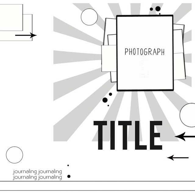
I've been browsing Pinterest a lot recently, especially for layout sketches for a project that I will be posting about in a few weeks. I was loving all these sketches I had pinned and those I was seeing on various blogs. I think I'd like to use more sketches as inspiration starting points for my layouts this year.
 |
| Citrus Twist Kits Sketch by Kasia |
 |
| Supplies: royal blue textured solid color cardstock; Heidi Swapp Mixed Company-Good Life patterned paper; Dear Lizzy Polka Dot Party-Polka Dot Plates patterned paper; Heidi Swapp Mixed Company Ephemera pack; Dear Lizzy Gold Soiree Glitter Foam Thickers by American Crafts; Blue Corn Navy Alphabean Stickers by Jillibean Soup; washi tape; gold doily; fuchsia doily; sequins; glassine bag |
I purchased a sun ray background from the Silhouette online store. I resized the original to a smaller image and then cut it out on a different piece of patterned paper. I then used that as a stencil to cut out the rays from my fuchsia patterned paper. The image had a frame around it, and I didn't want that as part of my layout, so that's why I decided to create a "stencil" to still achieve the sunburst look.
As you can see from these photos, the only part of my layout that follows the sketch really closely is the sunburst image, patterned paper layers and placement of the photo.
I love how I can start to follow the sketch very closely, but then I usually get so inspired and my layout becomes my own. I love the bright, unusual color scheme for this layout. It has definitely set the mood for my creativity this year!
xoxo,
Heather


4 comments:
Great layout, love the touch of gold :)
Nice interpretation of the sketch! I like the gold you used against the other colors.
Hello Heather! Kelly has me looking at other people's blogs with her Liebster award. What a fun way to get to know people. Love your take on the sketch here BTW.
Definitely pretty colors and layering!
Post a Comment